A good chart turns numbers into understanding.
The right visualization makes patterns, trends, and outliers jump out.
Data visualization presents data in visual form, such as bar charts, line graphs, pie charts, and scatter plots, so people can spot patterns quickly. The same data can be clear or confusing depending on how it is shown.
This topic is part of Big Idea 2: Data. You will learn to choose the right chart for a question and to recognize when a visualization is misleading.
Why this matters: Visualizations help communicate findings, but poor or distorted charts can mislead an audience, sometimes on purpose.
Match the chart to the question you are asking.
Each chart type answers a different kind of question.
The best chart depends on what you want to show:
- Compare categories → bar chart.
- Show change over time → line graph.
- Show parts of a whole → pie chart.
- Show a relationship between two variables → scatter plot.
- Show exact values → a table.
Whatever the type, a clear visualization needs honest axis scales, labeled axes with units, and enough context to interpret it. These details let viewers see real trends, patterns, and outliers without being misled.
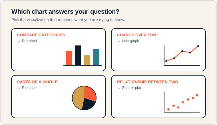
Four common questions and the chart type that answers each best.
Read each card as "question → chart." Comparing categories suits bars; change over time suits a line; parts of a whole suit a pie; a relationship between two variables suits a scatter plot. On the exam, first decide what the question asks, then pick the matching chart.
Talking about charts.
Use these terms to describe and critique visuals.
- Bar chart: compares values across categories using bars.
- Line graph: shows how a value changes over time.
- Pie chart: shows parts of a whole as slices.
- Scatter plot: shows the relationship between two variables as points.
- Trend: a general direction in the data over time.
- Outlier: a data point that differs greatly from the rest.
Memory hook: Lines move through time, bars stand side by side to compare, pies split one whole, and scatter points reveal relationships.
How visualization is tested.
Chart choice and misleading graphics both appear.
Be ready to:
- Choose the most appropriate chart for a question and justify it.
- Read a chart to identify a trend, pattern, or outlier.
- Spot a misleading chart, such as a distorted axis or missing labels.
- Explain that correlation does not prove causation.
A frequent trap is concluding that one thing caused another just because a chart shows them moving together. Strong answers separate correlation from causation.
Exam tip: If the question is about change across months or years, a line graph almost always beats a bar chart or pie chart.
Showing monthly library visits.
Pick the chart that answers the real question.
A student council tracked library visits each month and wants to show whether visits increased over time. Which visualization fits?
The question is about change over time, so the best choice is a line graph, with months on the horizontal axis and number of visits on the vertical axis. The line makes a rising or falling trend immediately visible.
A pie chart would be wrong here, because it shows parts of a whole at one moment, not change over time. A bar chart could display the monthly totals, but a line graph more clearly emphasizes the trend the council cares about.
To keep it honest, the axes need labels and units (months; number of visits), and the vertical axis should start at a sensible value so the trend is not exaggerated.
Visualization errors.
These distort the message or mislead viewers.
- Pie charts with too many categories. Many thin slices become unreadable.
- Bar chart when a trend matters. Change over time is clearer as a line graph.
- Missing labels and units. Without them, a chart cannot be interpreted.
- Distorted axis scales. Cutting or stretching an axis exaggerates differences.
- Confusing correlation with causation. Two variables moving together does not prove one caused the other.
Reframe: A chart should make the truth easier to see, never easier to hide.
Choosing a visualization.
Match the question to the chart.
| Chart | Best for | Watch out for |
|---|---|---|
| Bar chart | Comparing categories | Not ideal for time trends |
| Line graph | Change over time | Distorted vertical axis |
| Pie chart | Parts of a whole | Too many slices |
| Scatter plot | Relationship between two variables | Assuming causation |
| Table | Exact values | Hard to see overall trends |
Name the question before the chart.
The question decides the chart, not the other way around.
Before choosing a visualization, state in words what you want to show: compare, track over time, show a share, or reveal a relationship. The phrasing points straight to the chart type and gives you a ready justification for exam answers.
Try it: For each goal, pick a chart: favorite sports across a class, daily temperature for a week, budget split by category, and study time versus test score.
Practice — attempt these now.
AP-style assessments aligned to this lesson. Time them.
AP CSP Big Idea 2 Topic 5: Data Visualization — Set 1
AP-style topic practice assessment
AP CSP Big Idea 2 Topic 5: Data Visualization — Set 2
AP-style topic practice assessment
AP CSP Big Idea 2 Topic 5: Data Visualization — Set 3
AP-style topic practice assessment
AP CSP Big Idea 2 Topic 5: Data Visualization — Set 4
AP-style topic practice assessment